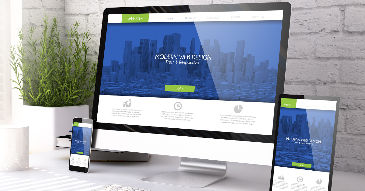
In today’s ever-evolving digital landscape, where users access websites and applications across a multitude of devices, ensuring your brand maintains a consistent and engaging presence is paramount. This is where responsive design steps in as a crucial element in your brand’s success story.
The Need for Adaptability
Gone are the days when desktop computers were the primary gateway to the internet. With the proliferation of smartphones, tablets, and various other devices, users expect seamless experiences regardless of the screen size they’re using. Statistics show that mobile browsing has surpassed desktop usage, making it imperative for brands to adapt or risk losing valuable engagement opportunities.
Understanding Responsive Design Principles
Responsive design isn’t just about making your website “fit” on different screens—it’s about crafting experiences that feel tailored to each device—ensuring that your brand’s message remains clear and captivating across all platforms. Touch-friendly design elements further enhance user interactions, making navigation effortless and intuitive.
Benefits of Responsive Design for Brands
Investing in responsive design yields numerous benefits for your brand. Not only does it provide a consistent brand experience, but it also boosts SEO performance, improves user engagement, and ultimately drives conversion rates.
Case Studies
Let’s take a moment to examine real-world examples of brands that have embraced responsive design successfully. Here are three examples of responsive business websites that have effectively implemented responsive design:
- Nike (www.nike.com): Nike’s website seamlessly adapts to various screen sizes, providing an immersive shopping experience whether users are browsing on their desktop, tablet, or smartphone. With fluid layouts and touch-friendly navigation, Nike ensures that users can explore their products effortlessly regardless of the device they’re using.
- Starbucks (www.starbucks.com): Starbucks’ website is a prime example of responsive design done right. Whether customers are planning their coffee runs on a desktop computer or checking out the latest promotions on their mobile devices, Starbucks’ website offers a consistent and visually appealing experience. The site’s responsive layout and optimized imagery make browsing and ordering a breeze on any screen size.
- Trello (www.trello.com) Trello’s project management platform boasts a responsive website that caters to users working on projects from their desktops, laptops, or smartphones. With intuitive navigation and dynamically resizing elements, Trello ensures that users can stay organized and productive no matter where they are or what device they’re using.
These examples demonstrate how responsive design can enhance user experience and contribute to the success of a business’s online presence. These brands have witnessed tangible improvements in user satisfaction, retention, and bottom-line results—all thanks to their commitment to delivering exceptional cross-platform experiences.
Best Practices for Implementing Responsive Design
Implementing responsive design requires careful planning and execution. Prioritizing content hierarchy, optimizing site performance, and rigorous testing across devices and browsers are just a few essential steps in ensuring a seamless transition to responsive design. Remember, it’s an ongoing process—continuously gathering user feedback and refining your approach is key to staying ahead of the curve.
Embracing Responsive Design
Responsive design isn’t just a trend—it’s a fundamental aspect of modern branding and user experience. If you’re ready to take your brand to the next level and ensure it shines brightly across all platforms, Tandem Studios is here to help. Schedule a consultation with us today, and let’s embark on a journey to transform your brand’s digital presence together. Your audience awaits—let’s make every interaction count.
