Introduction
One of the most powerful yet often underutilized elements in design is negative space. Also known as white space, negative space refers to the empty or open areas surrounding the design elements. While it may seem counterintuitive, this absence of content can be as impactful as the content itself. Mastering the use of negative space is key to creating designs that are both visually striking and functionally effective.
What is Negative Space?
Negative space is not merely an empty space; it’s a strategic design element that can shape how a viewer perceives and interacts with a design. Whether it’s the space between letters in a word, the area surrounding a logo, or the margins of a page, negative space has the potential to enhance the overall aesthetic and communicative power of your design.
Techniques for Using Negative Space Effectively
- Emphasizing Focus: One of the primary benefits of negative space is its ability to draw attention to the focal point of your design. By reducing clutter and distractions, you can guide the viewer’s eye to what’s most important. This technique is particularly effective in logo design, where a simple, uncluttered look can make the logo more memorable and impactful.
- Creating Visual Hierarchy: Negative space can help establish a clear visual hierarchy by organizing elements according to their importance. For instance, using more space around a headline compared to body text can make the headline stand out, guiding the viewer’s attention in the order you intend.
- Enhancing Readability: In typography, the effective use of negative space improves readability. Adequate spacing between lines of text, margins, and around paragraphs can make content easier to read and more visually appealing. It allows the text to breathe, preventing the design from feeling overcrowded.
- Balancing Design Elements: A well-balanced design uses negative space to create harmony between elements. By carefully considering the amount of space around each element, you can achieve a sense of balance that is pleasing to the eye. This balance helps to create a cohesive design that feels complete and intentional.
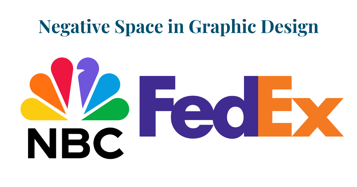
- Encouraging Creativity: Negative space can also be used creatively to add meaning to your design. For example, in logo design, the space around or within a logo can form shapes or symbols that reinforce the brand message. This technique, often seen in iconic logos like FedEx (the arrow between the E and x) or NBC (the peacock body in white), can make your design more engaging and memorable.
Benefits of Negative Space in Design
- Improved User Experience: Designs that incorporate negative space effectively tend to be more user-friendly. The absence of clutter allows users to navigate and understand the content more easily, leading to a better overall experience.
- Increased Visual Appeal: Negative space can give your design a clean, modern look that is visually appealing. It can make the design appear more sophisticated and professional, which can enhance the perceived value of your brand.
- Enhanced Brand Recognition: A minimalist approach that uses negative space can make a design more memorable. By focusing on simplicity and clarity, your design is more likely to leave a lasting impression on the viewer.
- Flexibility Across Mediums: Designs that effectively use negative space are more versatile across different mediums. Whether it’s print, digital, or environmental design, negative space ensures that your design elements maintain their impact and readability regardless of the medium.
A Powerful Tool
Negative space is not just an empty area in your design; it’s a tool that can enhance focus, readability, balance, and creativity. By mastering the use of negative space, you can create designs that are not only visually appealing but also functionally effective.
If you’re looking to elevate your brand with designs that leverage the power of negative space, our team at Tandem Studios is here to help. Contact us today to learn how we can transform your ideas into compelling visual experiences.
To learn more about branding and logo design, check out our post on that: Brand vs. Logo: What Sets Them Apart?
