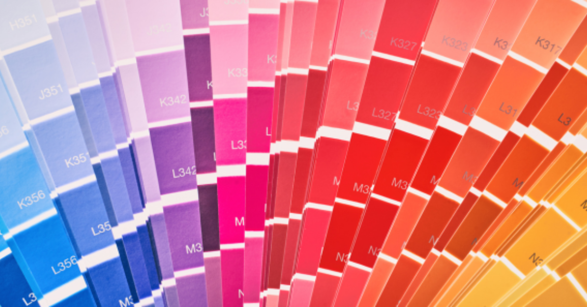
Whether you’re browsing a website, walking through a store, or flipping through a magazine, the colors around you are constantly influencing your emotions and perceptions. It’s important to understand the basics of color psychology to provide valuable insights into why certain designs resonate with us more than others.
What is Color Psychology?
Color psychology is the study of how colors affect human behavior and emotions. It explores the psychological impact of different hues and shades, and how they evoke specific feelings or associations. While the effects of color can be subjective and vary based on individual experiences and cultural backgrounds, there are some common associations that many people share.
The Power of Warm Colors
Warm colors like red, orange, and yellow are often associated with energy, passion, and warmth. They can evoke feelings of excitement, enthusiasm, and positivity. For example, the vibrant red of a Coca-Cola logo grabs your attention and can elicit feelings of excitement and energy.
Cool Colors for Calmness
On the other hand, cool colors like blue, green, and purple tend to have a calming and soothing effect. They are often associated with tranquility, trust, and stability. Many healthcare brands use shades of blue to convey a sense of trust and reliability, reassuring patients and customers.
Neutral Ground
Neutral colors such as white, black, and gray are versatile and can create a sense of balance and sophistication. They provide a neutral backdrop that allows other colors to stand out, making them ideal for minimalist designs or conveying a sense of professionalism.
Harnessing the Power of Color in Design
So, how can this knowledge of color psychology be applied in design? Whether you’re creating a logo, designing a website, or developing marketing materials, choosing the right colors has a significant impact on how your brand is perceived.
- Branding: When designing a brand identity, consider the emotions and qualities you want your brand to convey. Choose colors that align with your brand’s personality and values. A playful and energetic brand might opt for bright, cheerful colors, while a luxury brand might lean towards sophisticated, muted tones.
- Marketing Materials: When designing brochures, flyers, or advertisements, think about the message you want to communicate and the audience you’re targeting. Use colors strategically to evoke the desired emotions and create a visual hierarchy that guides the viewer’s attention.
- Website Design: In web design, color plays a crucial role in shaping the user experience. Consider the mood you want to create and the actions you want users to take. Use contrasting colors to highlight important elements, and ensure that text is legible against the background color.
By understanding the basics of color psychology, non-graphic designers can make more informed decisions when it comes to selecting colors for their projects. Whether you’re designing a brand logo, creating marketing materials, or revamping your website, harnessing the power of color can help you connect with your audience on a deeper level and leave a lasting impression.
Ready to Harness the Power of Color in Your Design?
If you’re looking to elevate your brand or design projects with the strategic use of color, we’re here to help. Schedule a consultation with us to discuss how we can create designs that resonate with your audience on a deeper level. Learn more about the difference between a logo and a brand.
